Huuto: one-tap attendance for my fire brigade, built on a Sunday
My unofficial Flutter client for Nimenhuuto: one-tap IN/OUT and calendar sync, built in a day with Claude Code from my own network captures.

Juho Torkkeli
· 9 min read
My volunteer fire brigade runs on Nimenhuuto, a Finnish team and attendance service. Drills, courses and station days all go there, and about 60 active members answer IN or OUT for them.
The official app is basically the website wrapped as an app. If I want to see all upcoming events before answering, marking myself IN or OUT takes about five taps. On top of that, I have to dismiss a paywall at least once every time I open it. The built-in calendar integration never worked for me, and as far as I remember it syncs every event, not only the ones I’m going to.
I’m the one in our unit who doesn’t really like the app, so this was my own problem to solve. I don’t even use it often enough for it to matter much, but it had annoyed me for a long time, and one Sunday I finally had the time. I have a rule for myself: if I’m not happy with an existing solution, I don’t really get to complain about it until I’ve tried to build a better one. That’s also how my garage door ended up in HomeKit.
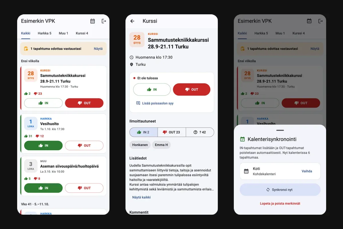
The result is Huuto, a Flutter app that opens straight to the event list, where IN and OUT are one tap each. From the first network capture to the first commit took about five hours.
Looking under the hood
I usually use Postman for this, but I had problems with its proxy, and Proxyman on my iPhone was faster to get working. I installed its root certificate on the phone so it could see HTTPS traffic, then clicked through the official app to capture the calls I cared about. I exported them from Proxyman as HAR files, 15 of them, and AirDropped them to my Mac by hand. In hindsight, fixing the Postman proxy would have been less work than moving a pile of files around manually.
I started a Claude Code session with Opus 5.5, gave it the captures and asked whether there was enough in them for the basics: logging in, listing events, answering IN or OUT, and opening an event’s details. It said there was.
The surprise was what the captures contained. There is no real API behind the app. It loads server-rendered HTML pages, the same ones the website uses, which makes sense for an app that is the website in a wrapper. So Huuto parses HTML with the html package and keeps a session the way a browser does. What it needs to stay logged in lives in the iOS Keychain or Android Keystore through flutter_secure_storage.
Core first, looks later
The app came out of that same session, and I was lazy about the setup: no skills, no rules, nothing about the tech. I just told it to make a Flutter app. I did the captures and decided what to build and in what order.
This was a proof of concept, and I treated it like one. The goal was a working app with minimal effort, just to find out whether the idea held up. So the first milestone was only the core: log in, list events, mark IN or OUT, open the details. I didn’t care what it looked like. The core worked on the first try, which surprised me even more than the missing API.
With the core in place, it was time for small UX refinements. The list got a tab per event type, taken from the types the server already has (Harkka for drills, Kurssi for courses, Muu for everything else), with counts. The long list got week dividers: “this week”, “next week”, then “week 41 · 5.–11.10.”. A banner shows how many events are still waiting for your answer, and tapping it filters the list down to those.
Every card has its own IN and OUT buttons. The answer shows up immediately and rolls back if the request fails. Going OUT opens a sheet with quick reasons (work shift, sick, traveling, other plans) or your own text, and you can skip it.
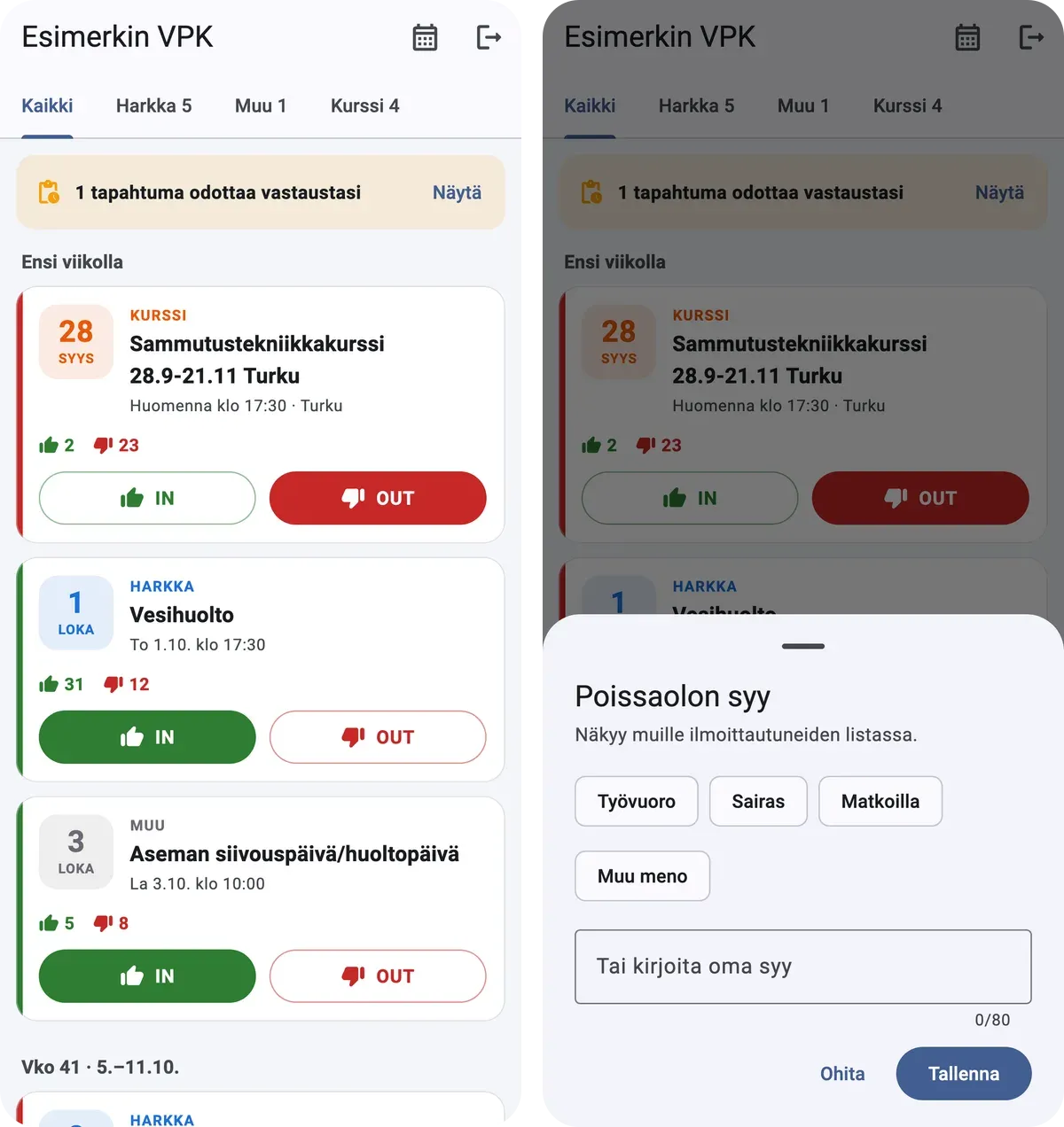
I gave no visual instructions at all. The only design rule was that the app should be simple and need as few taps as possible. I was surprised how decent the result looked, and dark mode worked out of the box. It didn’t feel like complete AI slop, at least for a proof of concept, and for my own use it doesn’t need a full revamp. If this became a real product, I’d rework the visual hierarchy, especially on the event details page, so you don’t have to scroll as much.
Calendar sync
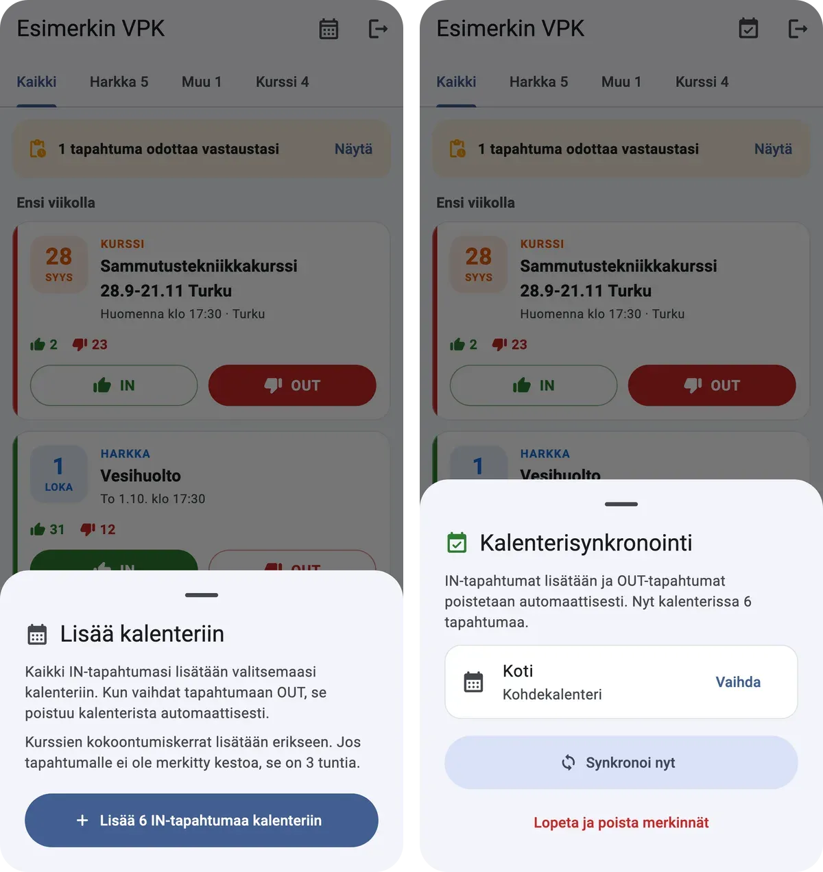
Next came calendar sync, so the events I’ve answered IN to show up automatically in the calendar I prefer. It goes through device_calendar_plus, which wraps EventKit on iOS and the Calendar Provider on Android. The rules were simply my first ideas, based on how I use the app:
- Answering IN adds the event to a calendar you choose. Answering OUT removes it.
- If an event has no end time, the entry defaults to 3 hours. That’s how long our weekly drill takes, and it’s good enough for now.
- Entry titles start with the event type, like “Harkka: Vesihuolto” (drill: water supply).
- Some courses list several dates in one event. I had Opus parse the real session dates and times from the event details, so a course becomes one numbered entry per session (1/5, 2/5 and so on).
After Opus had the first version of the sync working, I went through it, pointed out the weak spots and had Opus make it more robust, mostly so it would never create duplicate events. Where it ended up:
- Every entry carries a marker (the event ID plus a hash) in its notes and URL, so re-syncing, or even reinstalling the app, never creates a second copy.
- Calendar operations run in a queue, so tapping IN and OUT quickly can’t interleave them.
- A multi-session course is created all or nothing.
- Canceled events are removed from the calendar, and if the chosen calendar is deleted, the app asks for a new one.
It makes for a really pleasant experience. I tap IN, the event appears in my calendar, and on the day I can see the drill’s topic and any notes, like something I need to bring, without opening Huuto or Nimenhuuto.
One more capture pass: comments
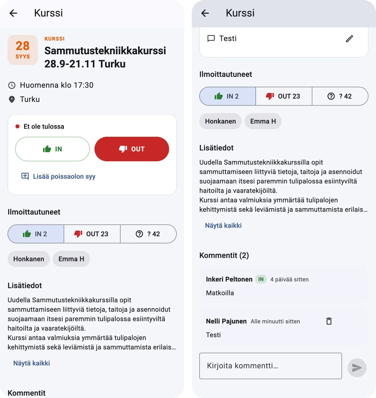
Last, I went through the official app once more, looking for anything else I’d actually use, and found that commenting on events would be useful. That meant another round of captures, 16 HAR files this time, and then I gave Opus the task of adding it. The event page now shows the comment thread, with an IN or OUT badge on comments posted together with an answer, and you can post and delete your own comments.
What the code looked like
That lazy setup turned out to be a good experiment in how far an LLM gets on a greenfield project with no tech-specific instructions. I think it shows how well Flutter works with agentic coding. The nice bonus is that it’s cross-platform for free. It runs on Android too, so friends with Android phones can use it without extra work, apart from the code signing any release needs anyway. The web is the one exception, because the site doesn’t allow cross-origin requests from a browser.
Code quality, on the other hand, was quite bad at the start. It wasn’t modular, feature code was spread all over the place, it followed some older Dart conventions, and there were plenty of functions returning widgets. For a proof of concept that barely matters, but I had Opus do a few cleanup passes with clear instructions on what to change, and that got it into decent shape. Stricter analyzer rules and a tool like DCM would have prevented some of the bad practices, but I think the architecture would have been a mess regardless.
The app has 48 automated tests, including golden screenshot tests. The parser tests run against real captured pages, with members’ names, absence reasons and user IDs replaced by fake data first. The screenshots in this post are those golden images, which is why the team is called “Esimerkin VPK” (Example VPK) and the names are made up.
Status (September 2026)
Huuto talks to Nimenhuuto the same way the website does, and it’s their service, so the code stays private. For now it runs as a release build on my iPhone.
The plan is to keep it simple and add things users might actually need, like better filtering for events. It also needs to get onto friends’ phones through TestFlight and Google Play internal testing, which still takes a real app icon instead of the placeholder, and proper release signing on Android.