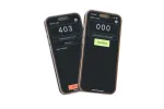
Design refresh for Laikku
A Figma redesign of Laikku, made while exploring a joint app with the developer of a similar one I came across after changing brigades.

Juho Torkkeli
Overview & background
It was time to continue developing Laikku and bring its user interface up to date. The project was also a good chance to learn Figma properly.
When I moved from one volunteer fire brigade to another, I came across a similar app and talked with its developer about working together. The first phase was aligning the features of the two apps and sketching what a shared interface could look like.
The original interface was dated and needed both a visual and a functional refresh, and the talks gave us a reason to look for a shared direction.
Development process
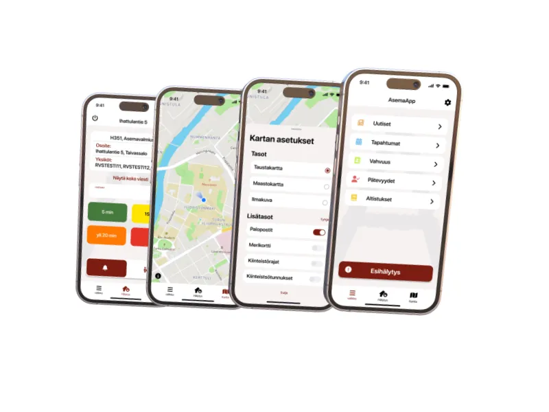
This phase was design only, with no code. I started by picking a color theme. Then I laid out the interface around what users need to reach fast in an emergency. The map got a more prominent place, and I added layer switching to control what the map shows.
Outcome
The design convinced both of us, the developers of the two original apps, that combining our work had potential. It became a concept UI and the foundation for a possible collaboration. Members of the rescue department who saw it described the UI as clean and modern.
Next steps
- Full implementation of the app. The project went on hold when the Southwest Finland Rescue Department ran a selection process for a similar app to adopt across several municipalities, which left no clear path to wider deployment.
Technologies & tools
- Figma